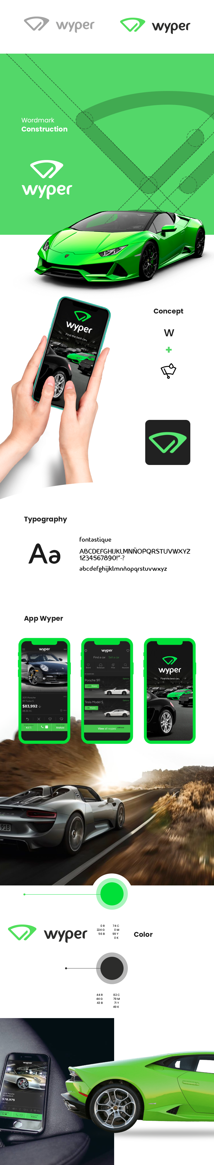
close-icon

Wyper Logotype

Commissioned for Wyper was to generate a logo based on the concept of sliding the screen in search of the indicated car (Wyper had a strong concept as it was intended to be the vehicle's tinder), also making an analogy with the windshield wiper. In this way and with these concepts, the letter W was combined with the windshield wiper and the movement gesture creating a logo that meets customer requirements and brand purposes. Also important to mention the diagonal shapes that are also present in the isotype which reinforce the concept of movement.

Date: 27 Jan 2016
Client: Wyper
Role: Art Director
Tags: #Logotype


  • Company: Wyper
  • Client: Wyper
  • Concept Logotype : Rodrigo Luna
  • www.wyper.co
  • 2016